
In today’s digital age, where smartphones, tablets, laptops, and desktops are all used to access the internet, it’s more important than ever for websites to be designed with responsiveness in mind. Responsive design ensures that a website looks and functions well on any device, regardless of screen size or orientation. In this article, we’ll explore the concept of responsive design, its benefits, and how to implement it effectively.
What is Responsive Design?
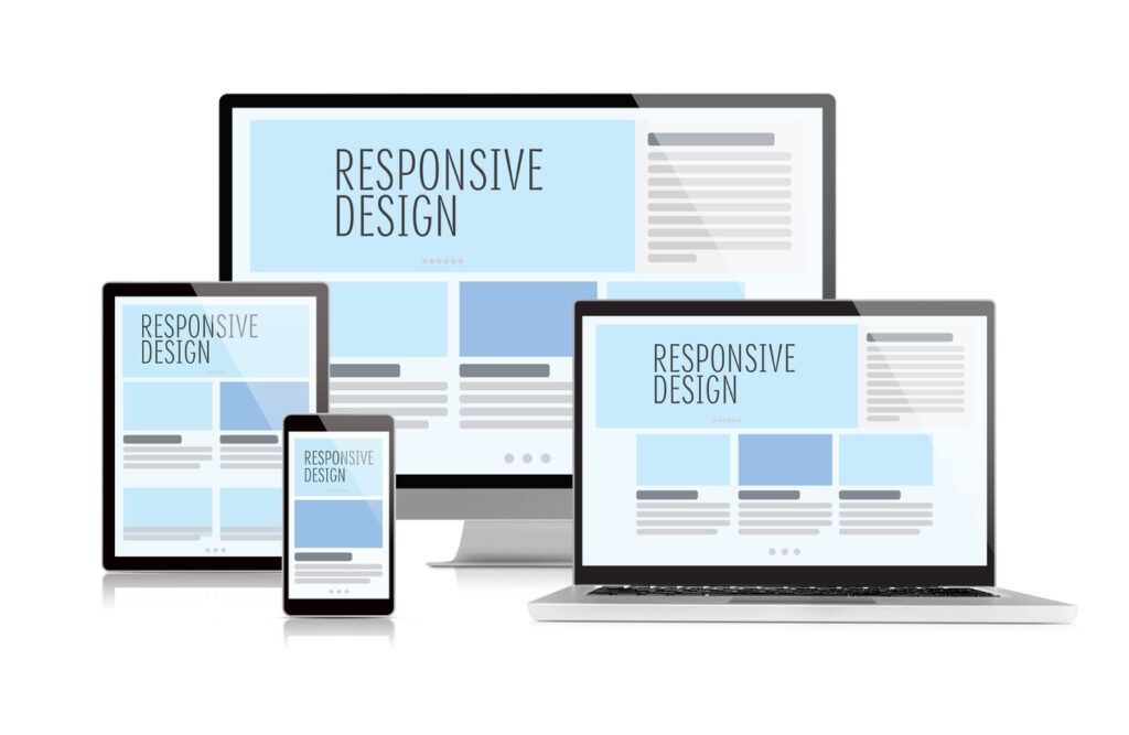
Responsive design is an approach to web design that makes web pages render well on a variety of devices and window or screen sizes. It ensures that users have a good viewing experience no matter what type of device they’re using. Responsive design uses flexible layouts, images, and CSS media queries to achieve this goal.
Why is Responsive Design Important?
Accessibility:
It ensures that your website is accessible to all users, regardless of the device they’re using. This is especially important as the number of mobile internet users continues to rise.
Improved User Experience:
It provides a consistent user experience across all devices, which can lead to higher engagement and conversion rates.
SEO Benefits:
Google and other search engines prioritize mobile-friendly websites in their search results. By implementing responsive design, you can improve your website’s SEO performance.
Cost-Effective:
Instead of creating separate websites for different devices, design allows you to maintain a single website that adapts to various screen sizes. This can save time and money in the long run.
Future-Proofing:
With the rapid evolution of devices and screen sizes, responsive design helps future-proof your website by ensuring it can adapt to new technologies.
Principles of Responsive Design
Fluid Grids:
Use percentages instead of fixed pixel values for widths, so elements on the page can adjust fluidly to different screen sizes.
Flexible Images:
Use CSS to ensure images resize proportionally based on the width of the viewport.
Media Queries:
Use CSS media queries to apply different styles based on the device’s characteristics, such as screen width, height, or orientation.
Viewport Meta Tag:
Use the viewport meta tag to control the layout on mobile browsers, ensuring that the page renders correctly on small screens.
Progressive Enhancement:
Start with a basic layout that works on all devices and then enhance it with additional features for larger screens, rather than starting with a complex layout and trying to scale it down.
Best Practices for Responsive Design
Mobile-First Approach:
Start by designing for mobile devices and then progressively enhance the design for larger screens. This ensures that the website is optimized for smaller screens first.
Performance Optimization:
Optimize images and code to ensure fast loading times on all devices, especially mobile devices with slower connections.
Touch-Friendly Design:
Use larger touch targets and avoid relying on hover effects, which don’t work well on touch screens.
Content Prioritization:
Prioritize content based on importance, ensuring that the most critical information is prominently displayed on all devices.
Testing:
Test your website on a variety of devices and screen sizes to ensure that it looks and functions as intended.
Implementing Responsive Design
Use a Responsive Framework:
Frameworks like Bootstrap, Foundation, or Materialize CSS provide pre-built components and grid systems to help you create responsive websites quickly.
Custom CSS:
Write custom CSS using media queries to adjust the layout, fonts, and other styling based on the device’s screen size.
Responsive Images:
Use the srcset attribute in HTML to provide different image sources based on the device’s screen size, ensuring that the most appropriate image is loaded for each device.
Viewport Meta Tag:
Include the viewport meta tag in the <head> section of your HTML to control the layout and scaling on mobile devices.
Testing:
Use browser developer tools or online services like BrowserStack to test your website on various devices and screen sizes.
Conclusion
Responsive design is essential for creating websites that provide a consistent and user-friendly experience across all devices. By following the principles and best practices outlined in this article, you can ensure that your website is accessible, user-friendly, and optimized for search engines. Responsive design is not just a trend but a necessity in today’s multi-device world.